9 Elements for Responsive Website
Website is an integral part of your business. Being professional and reliable on your online forum is a fact in today’s world that cannot be denied. But at the same time, it might not be that easy. A good website must be competent, as well as attractive.
What is a Responsive Website?
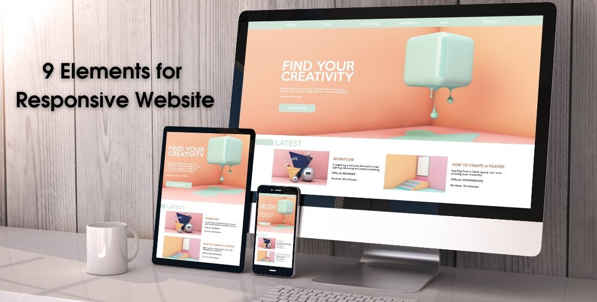
It is certainly important for your website to be responsive. It should be adaptive to all screens such as laptops, desktop, android mobile devices, iPhone, or iPad. A good website is compatible with any device size rather large or smaller.
Being responsive is essential for a website to ensure the reader an easy-to-read format. Likewise, it allows mobility to the users to open the site on any handy device available. It ensures a quality user experience on any kind of device.
How to Make a Responsive Website?
Here are some key features or elements that could help make your website even more responsive.
Accessibility:
Accessibility is the most important factor. Your site should be compatible and accessible for every device. To sound more professional, all the content of your website, including menu, prices, and contact information, should be easy to find for the reader despite the fact which device he/she is using.
Flexibility:
If you want your website to be responsive, you should be careful about its images. You must scale your pictures according to the screen on which your site is going to be opened. While creating a responsive website, you must keep an eye on the layout. Moreover, be cautious about your website’s theme as it leaves a great impact on the reader.
Fluid grid:
A fluid grid is a flexible grid that automatically resizes according to the size of the screen. They are designed on percentage values rather than fixed pixels, which were used years before. A fluid grid sizes the elements of your website proportionally instead of making them one specific size. The proportions depend on the size of the screen, the elements are divided into columns, with adjustable scales of width and height.
4: Whitespace:
The whitespace is the space between the elements of your website. It is a basic rule of the modern graphic world. It allows the screen to breathe and avoid saturation on the screen, which the reader will not like much. Whitespace means the negative space on the screen. As said, ‘less is always more’, whitespace is necessary to enhance the visual communication experience. You should follow minimalism. Too many colors and images will distract the user’s attention. So if you want your website to be responsive, it should fulfill the principle of whitespace.
SEO:
A responsive website should also fulfill the criteria of Search Engine Optimization (SEO). An SEO friendly website will draw more audience traffic from Google. SEO plays a vital role in web design. It includes several factors. The basis of SEO is the usage of keywords. On the other hand, a responsive website also helps to boostyour SEO, which means your business will grow faster. So you have to keep SEO rankings in your mind if you want responsiveness for your website.
If you dream to get an SEO friendly website designed by skillful web designers and developers, you should hire the services of a web design firm.
Speed:
According to Search Engine Journal, you might only have up to one second to load for your site before your user gets frustrated and leaves your page. If you want the audience to stay on your page, your website should be quick and fast. In today’s fast-paced era, everyone has a lack of time. Users don’t stay long on your site if it is taking too long to load. He will move to another website which is providing faster services than you.
To ensure speed on your website, you can implement various techniques as caching, minification, improving your critical rendering path, using a more efficient layout, optimizing your images, and many other strategies.
Responsive Media:
Media, particularly images are the most essential part of your web design. A picture is worth a thousand words. But at the same time, you should be cautious about the media, images, and videos you are using on your site. Selecting the media for your site could be the most challenging task for you. High-resolution photos are not recommended as they take more time to load, and they are not so flexible to adjust according to every screen. Choosing the media that is accessible on all screens is a factor you should not ignore.
Scaling your images, a go-to solution. You have to set the max-width 100% to scale the image. But it is not applicable every time. You can try the Adaptive Images technique to optimize your images according to screen sizes. CSS is another trick used for this purpose.
Mobile Responsive Design and layout:
Along with all the other methods, your website should have a mobile-friendly design and adaptive layout. This is the most effective technique. Mobile is now a part of our lives. Most of the searches are now done through mobiles. According to Statista, 50.81% of global website traffic is generated through mobile phones. This is about half of the traffic which is coming through mobile. It’s a huge number. So it means your website should be adaptive and easily accessible through a mobile phone. That’s why you should always hire expert web developers to design your website to ensure responsiveness.
For instance, Logozila I.T company can design a professional and user-friendly website for your business. It was stated long ago by Google that mobile-friendly pages would rank higher in its algorithms. That’s why your site needs to have a mobile responsive design and layout.
Typography:
Flexible text within the layout of your site is another important aspect of being responsive. Good typography makes your site more flexible on any kind of screen without any hassle. The text should be clear and accessible to the reader. Be careful about the selection of fonts and colors also. Fonts should be adjustable to the screen size. While using fonts for mobile, always view it on the actual screen. This might be helpful for you.
Last Words
The above elements are key to a responsive website. However, you should update your site with fresh content so that it remains on the top Google searches.
Thank you for reading!