What Is Big Data Visualization? What Are Its Techniques?
What is Big Data Visualization?
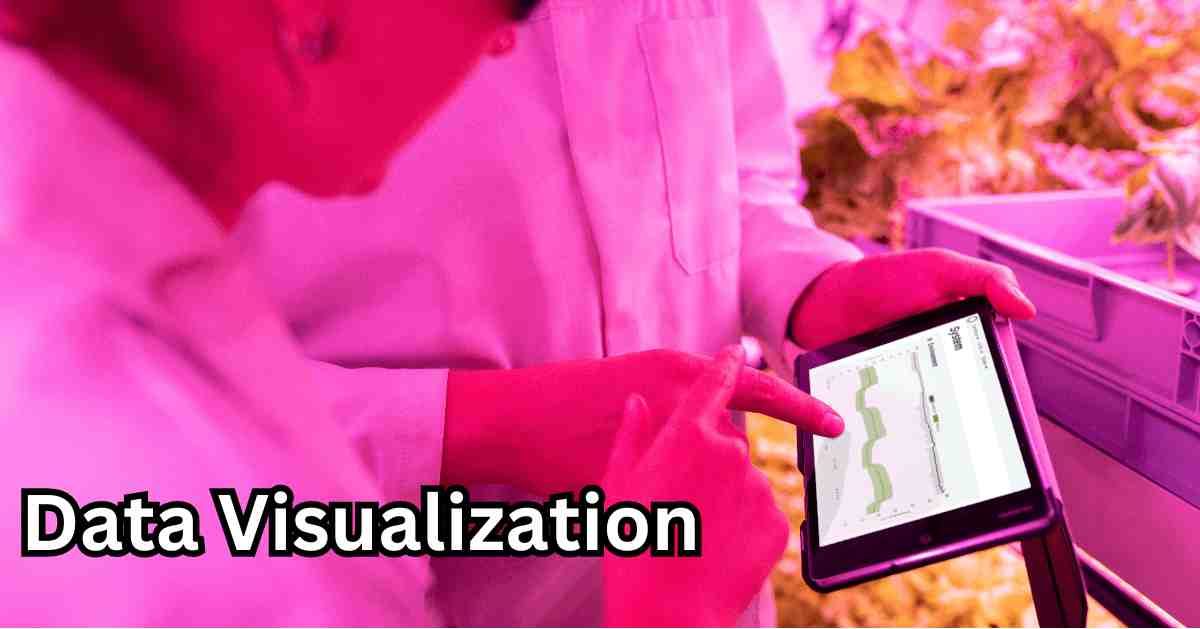
Big Data Visualization means taking the help of various elements like maps, pie charts, and graphs to graphically represent any fact or information. The use of big data visualization tools simplifies complicated information. It also facilitates better statistical analysis to make an informed decision.
The primary purpose of data visualization is to help readers understand any issue more closely and without any ambiguity. In other words, it simplifies difficult statistics and algorithms and helps the reader easily comprehend the same.
Especially for large and medium scale businesses, big data professionals closely scrutinize each aspect of data visualization to help stakeholders take appropriate business decisions. Data visualization and big data visualization denote the same thing. Both terms have been used interchangeably throughout this article.
What are the big data visualisation challenges?
Big Data is a complex dataset with a high volume. Because traditional data visualisation techniques have several drawbacks, such data cannot be seen using them.
Perceptual Scalability: From a significant amount of input, the human eye is unable to fully extract all of the pertinent information. If the dataset is vast, even desktop screens can have their constraints. It’s not always possible to fit too many visualisations on a single screen.
Real-time scalability: Real-time information is always desired, but it is rarely feasible due to the time required to process the dataset.
Interactive scalability: Interactive data visualisation aids in understanding the contents of datasets, however because large data volume grows exponentially, it takes a while to see the data.
But the problem is that occasionally, when attempting to visualise the datasets, the system may freeze or crash.
Merits And Advantages of Big Data Visualisation
- According to a research report by MIT (Massachusetts Institute of Technology), brains receive visual information better than text.
- Data Visualisation facilitates better comparative study and analysis.
- Colors and patterns in the data presentation help readers understand the nitty-gritty of any issue better.
- Data Visualisation is a more attractive and unique way of presenting facts without looking monotonous.
- Data Visualisation helps you grasp the underlying trends and gist of the information without getting confused.
- Sometimes, presenting data on a spreadsheet takes lots of time and effort. A simple bar graph or pie chart is enough to represent the same data easily and quickly.
- Good data visualization presents all significant facts in a detailed manner without looking into text and spreadsheet columns.
How can massive data visualisation blunders be avoided?
Giving business users insights is big data visualization’s primary goal. It may seem more difficult than it is to select the best visualisation tool from the many available choices (Microsoft Power BI, Tableau, QlikView, and Sisense are just a few product names) and use the proper strategies to produce clear and understandable dashboards. If you believe that you require any help with this matter, you may enlist the aid of big data consultants to assist you in selecting and/or customising the best visualisation solution.
[Read more: Big Data in Healthcare – Everything You Need to Know]
Big Data Visualisation: Types And Techniques
The conventional bar graphs and pie charts still form the core elements of data visualization Services. However, in the last few years, several new techniques and types of big data analysis have emerged and started getting used for both academic and business purposes.
- Maps
- Flowchart
- Infographics
- Tables
- Dashboards
- Graphs
- Bar chart
- Pie chart
- Bullet graph
- Cartogram
- Word cloud and many more.
There is no end to this list. Some new elements are added to this list every month and find their use in data visualization purposes.
Uses of Big Data Visualisation
- Big Data visualization has an overwhelming use while writing academic papers or research reports.
- Data Visualisation is a key in government surveys before they proceed with any development work.
- It is crucial to helping entrepreneurs take the right decision at the right time.
- Data visualization is useful for sales personnel to extract meaningful data for sales conversion.
- Corporate tycoons and thought leaders often refer to data visualization tools and elements before announcing new plans or implementing any decision.
- All companies and organizations hire data scientists and statisticians these days. The primary task of data professionals is to extract meaningful information from raw data to help the companies multiply their profits and ROI.
[Read more: What is Big Data Security? Top Challenges and Solutions]
The Conclusion
We are now living in a digital era. According to Kissmetrics, high-quality infographics and other forms of data visualizations are likely to be read 30-times more than plain text.
However, you can’t use all forms of data visualizations at the same time. You have to strike a perfect balance between the types of elements that you should use in your research report or survey article and the length of the text to be used in the same. This is how you can create a perfect balance between data, elements, and text while enhancing its readability.
FAQs (Frequently Asked Questions)
Which are some of the most popular techniques of Big Data Visualisations?
Line Charts-These are used quite prominently for analyzing sales, ROI, and profits of the company. Firms can also use line charts to analyze their weekly feedback reported by customers.
Bar charts: It helps firms and business houses understand the intricate aspect of sales like which products were sold in maximum quantity, how much traffic was generated on a particular web page, and many other details.
How can you use Pie Charts to show data?
Pie charts have become a frequently used element for big data analysis. Under a pie chart, the entire component is assigned 100%, and other key statistical figures are traced out as percentages to the whole component.
How can you perfectly visualize big data?
It depends upon the tools that you use for such visualization. You can use Tableau, QlikView, graphs, Infographics, and various other tools to make a stunning big data presentation using these tools. You must have a good command of these tools before using them in your big data presentation.
If you are new to big data getting familiar with key concepts of big data elements and visualization tools can help you a lot.