Maximize User Interaction: 8 Website Design Elements You Can’t Ignore
User interaction in web design has become increasingly crucial in the current digital era when websites operate as the public face of companies and online services. Websites with seamless and exciting user experiences frequently draw and keep visitors. As a result, user-centric web design is now the norm instead of the exception. User-centric web design is the gold standard in today’s digital environment. This article explores the foundational components of website design that can significantly improve user engagement. Each piece is essential to building a website that engages users, keeps them interested, and motivates them to take the necessary activities.
1. Intuitive Navigation
Intuitive navigation is the basis of a compelling user experience. It involves developing a logical flow that directs users across the website. Designers must consider the hierarchy and structure of the site to ensure simple navigation. This calls for logical content organization, short and clear menu item labels, and carefully considered placement of links and buttons. Additionally, offering customers a search tool can improve navigation even more, particularly on websites with much content. Users are more likely to stay on a website and explore more of its features when it has easy-to-use navigation. Designers can incorporate easy navigation with user testing, gathering user input, and continuously examining user behavior to improve the site’s structure.
2. Clear Call-to-Action (CTA) Buttons
Calls-to-action (CTAs) are the signposts on a website that direct visitors to the intended actions. These can be anything from completing a purchase to seeking more information to subscribing to a newsletter. CTAs fuel conversions and, by extension, the success of many websites.CTA buttons should be distinguished from the other page content through placement and style. Designers and marketers can use various techniques to produce compelling CTA buttons. Use A/B testing on different variations to determine the optimum button designs, sizes, colors, and positions. The CTA must also align with the user’s intent and where they are in the customer journey.
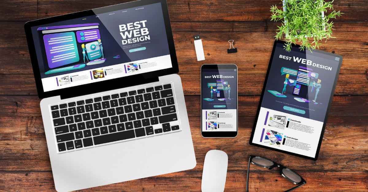
3. Engaging Visual Content
A website’s visual content can significantly improve user involvement. Engaging images offer people a break in the information overload age while making content more captivating and remembered. Visual material is significant because it can swiftly convey complicated ideas, arouse emotions, and grab people’s attention. This includes images, movies, infographics, and other multimedia components. Text-heavy pages can be broken up with visual elements to make the content more readable. A product demonstration video, for instance, can explain how a product works more clearly than a series of texts. There are many different alternatives for compelling images. A visually appealing website must have high-quality photos and pictures. Infographics are great for visually appealingly conveying data and statistics. Videos can be used to tell stories, showcase products, or include customer testimonials. Additionally, unique images and illustrations can support the communication of a brand’s identity. Designers should consider the website’s overall concept and message when incorporating graphic material. The website’s branding should be reflected in the visuals, and the audience should be reached. To ensure that they improve rather than detract from the user experience, optimizing images and videos for quick loading is also essential.
4. Mobile Responsiveness
Mobile responsiveness refers to the approach to website design that guarantees a website works flawlessly and looks beautiful across different screen sizes, from smartphones to tablets. It is important because users want a consistent, user-friendly experience no matter what device they use. Not meeting these expectations can result in high bounce rates and missed leads. Limited screen space is a common concern for mobile-responsive designers. Content and functionality must come first, and designers must ensure that all crucial components are equally accessible on smaller screens. Text and buttons need to be the right size for touch interactions, and navigation menus may need to be simplified. Starting the design process with mobile devices in mind is one of the strategies for mobile-first design. This strategy pushes designers to concentrate on the essential functions and information that users value most. Additionally, responsive design strategies can change the layout to fit multiple screen sizes, such as fluid grids and flexible graphics.
5. Fast Page Load Times
The website’s page speed strongly impacts user engagement. Users grow irritated and are more likely to leave a website when pages load slowly. On the other hand, quick-loading pages improve user experience and can increase user interaction rates.According to research, even a one-second delay in page load times can cause a sizable decline in conversion rates. When users’ expectations are unsatisfied, they are inclined to look for alternatives. Users want websites to load promptly.Web designers should prioritize performance throughout the design process to guarantee quick page loads. This includes using content delivery networks (CDNs) to distribute content effectively, choosing lightweight design components, and reducing HTTP requests. Regular performance testing and optimization are crucial to maintaining quick load times as a website develops.
6. Effective Forms and Input Fields
Forms prove helpful for various functions, whether registering users or conducting online transactions. The purpose of forms in web design is to make it easier for users to submit information or take action.A lengthy, complicated form will only overwhelm the user, resulting in form abandonment. Unclear instructions or poorly labeled fields can cause confusion and mistakes during submission. Additionally, consumers may become irritated by forms that are not mobile-responsive.The number of mandatory fields must be kept to a minimum, instructions made explicit and sensible defaults can be used when necessary to develop user-friendly forms. Users can enter data more accurately by utilizing features like input masking and real-time validation. Mobile optimization is essential because responsive form design allows people to interact with forms easily on smartphones and tablets.
7. Personalization and User Experience
Customizing each user’s experience based on their choices, actions, and demographics is known as personalization in web design. It aims to offer a more relevant and exciting experience while acknowledging the individuality of each user.Personalization can improve customer satisfaction, raise conversion rates, and increase user engagement. It aids users in finding materials, goods, or services that correspond to their interests, eventually resulting in a more favorable opinion of the website.User information can be gathered through registration, browser history, or user surveys as part of personalization implementation strategies. Then, content, products, or services that suit the user’s preferences can be suggested based on this information. User interface components can also be personalized, for example, by showing custom greetings or recently seen products.
8. Feedback Mechanisms
User comments can provide insightful information for enhancing user interaction on a website. Users have a platform to express their ideas, raise problems, and make improvements thanks to feedback methods. They are essential in determining the wants and expectations of the user.Surveys, contact forms, comment sections, and user reviews are just a few ways feedback can be sent. It can point to places where there may be a lack of user involvement or if the user experience is subpar.Websites should incorporate accessible, user-friendly feedback systems to collect and act on user comments effectively. To achieve this, feedback forms must be clear and appealing, users must feel respected, and comments must be addressed quickly. Additionally, rigorous analysis of the input is necessary to spot patterns and set priorities for improvement.
Conclusion
The crucial web design components mentioned above are vital to maximize user interaction on a website. They include intuitive navigation, unambiguous call-to-action buttons, captivating visual content, mobile responsiveness, quick page loads, efficient forms and input fields, personalization, and feedback mechanisms.By including these components in their web design strategies, designers and businesses may develop user-centric experiences that encourage engagement and happiness. It is imperative to continuously focus on user interaction in the ever-changing world of web design to match changing user expectations and preferences.